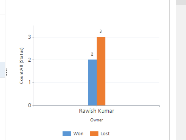
Until recently I thought that Gantt charts couldn’t be done in MS Dynamics CRM without turning to some serious development, which I found unfortunate because this is a popular type of chart and users find them easy to read. Turns out you can, and it’s not that difficult to create a simple Gantt Chart in MS CRM.
EDIT regarding CRM2011: This post relies on changing the aggregate of a date field to “min”, which seems to be exclusive for CRM2013. CRM2011 will give you an import error when you make that change to the xml. However, a reader has been kind enough to send me the details of how make it work for CRM2011. In the fetchxml you will need to remove the aggregate=”min” from each of the attributes, and also remove the groupby=”true” along with its corresponding alias in the categorycollection. Thank you Nils for sharing.
In this…


